 ART PROCESS
 BACK
BACK
This is an art process, not really a tutorial. Though I won't blame you for following it as a tutorial, I have no autority on how to make art. I'm an advanced hobbyist, not a teacher !
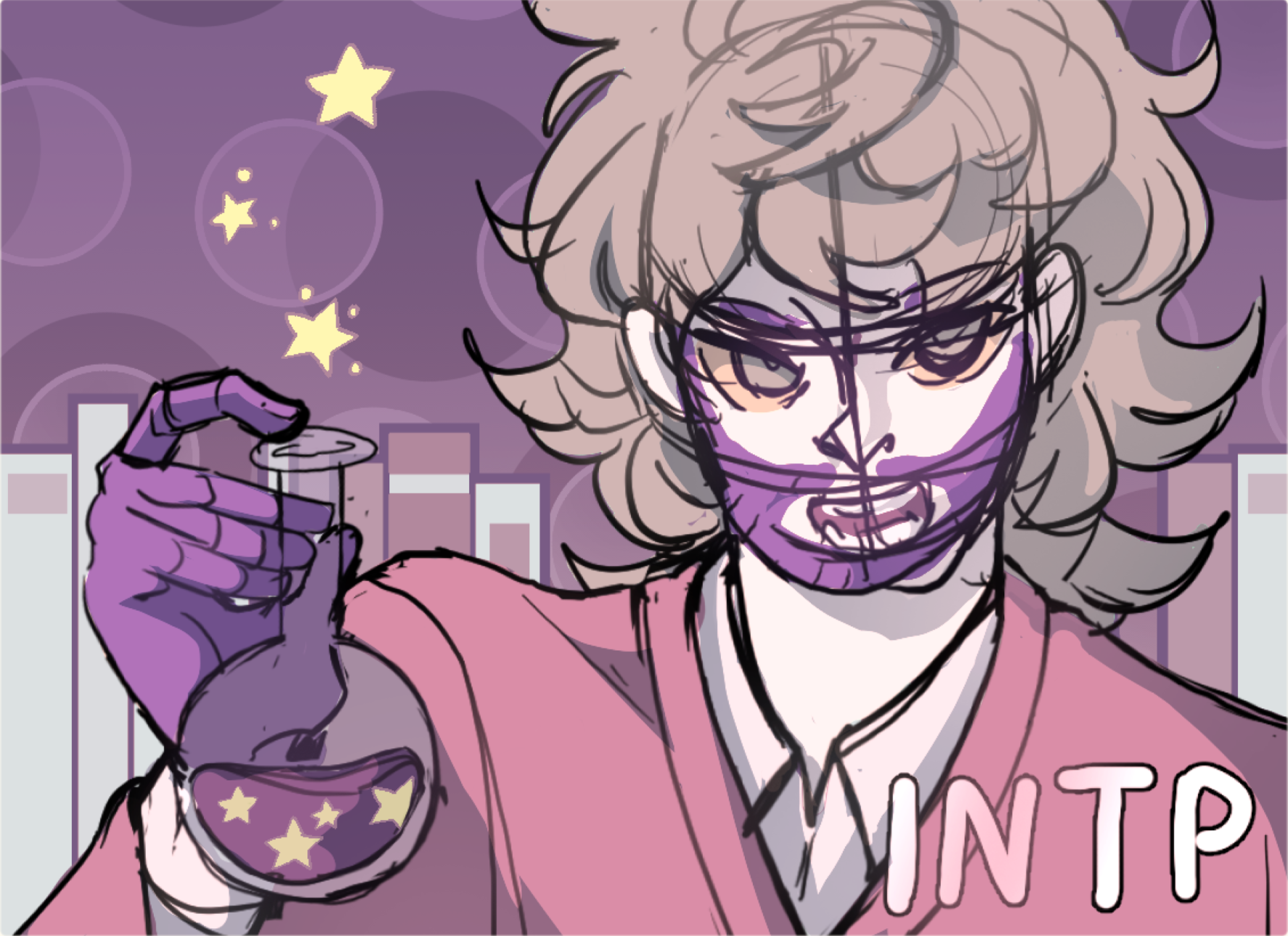
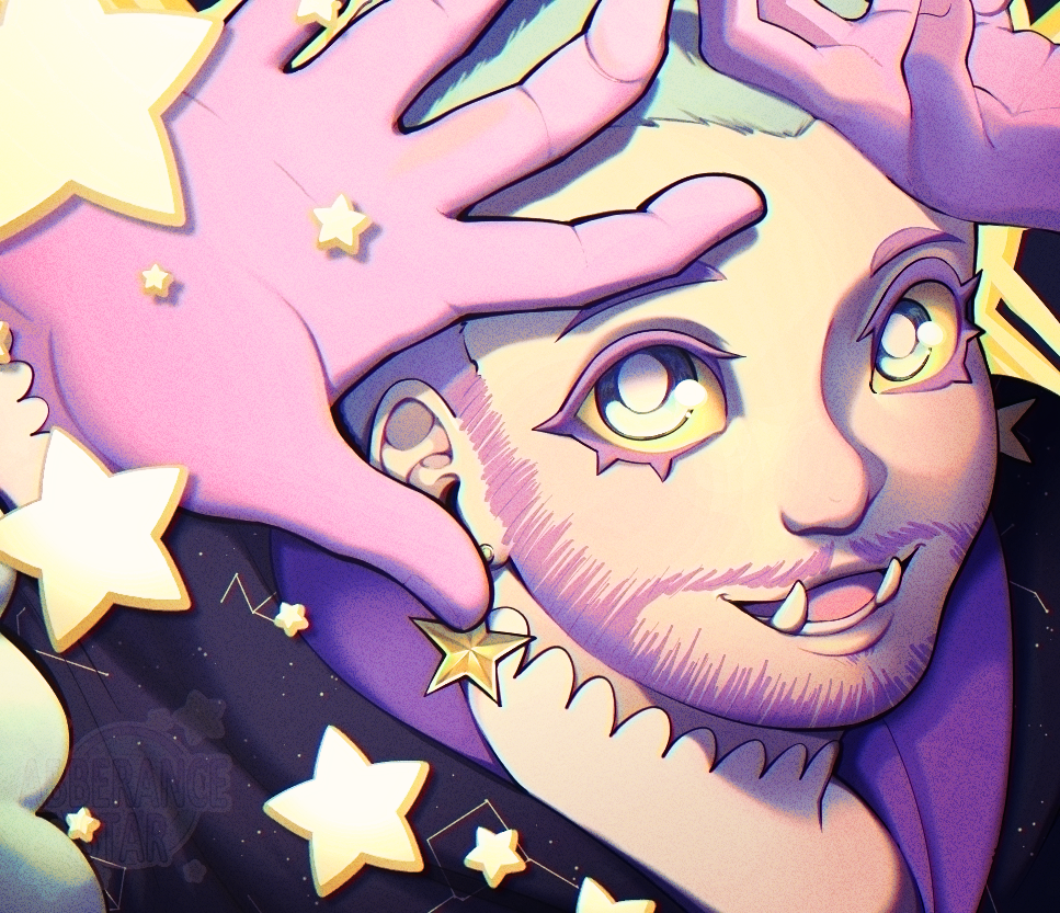
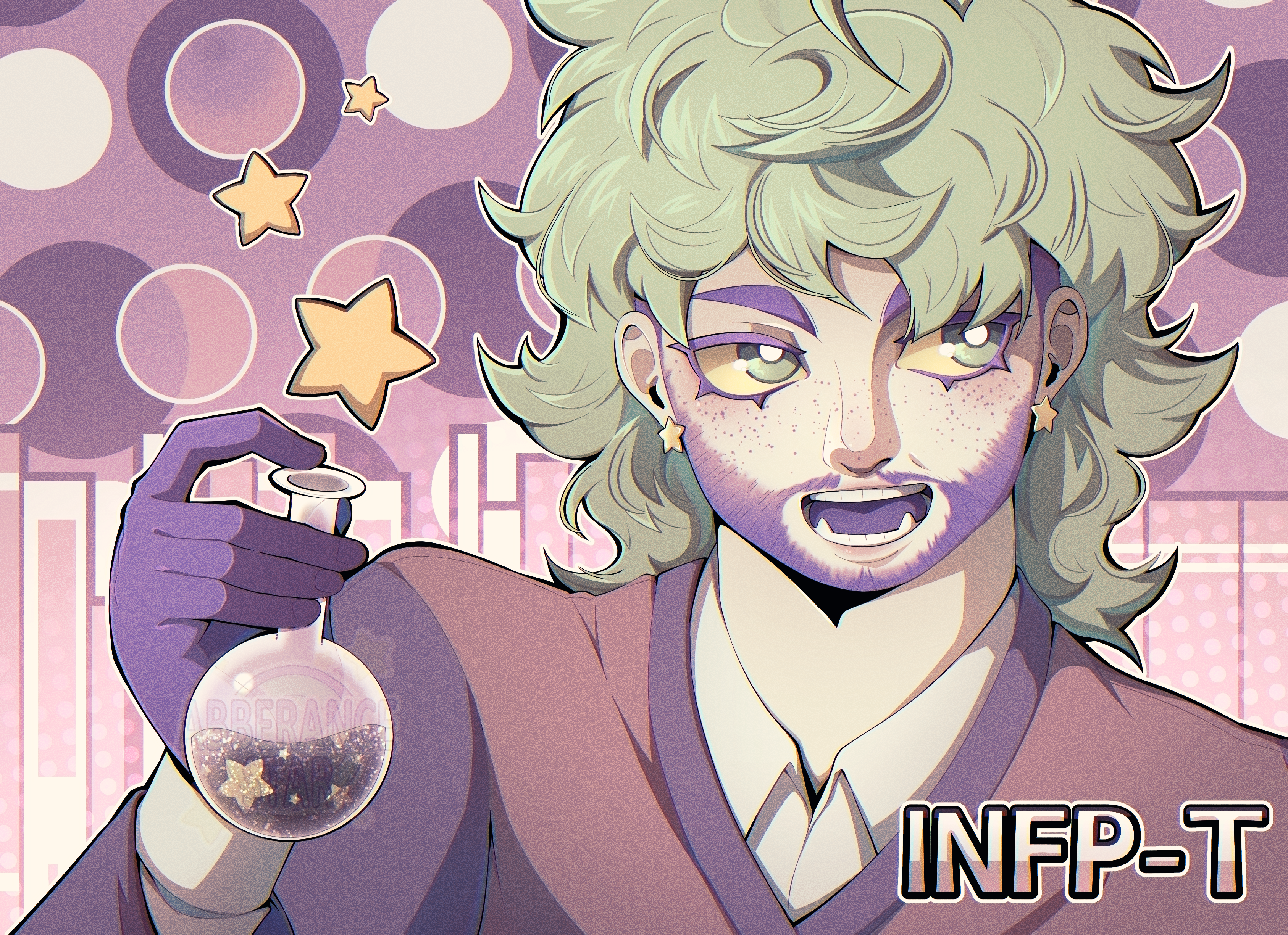
Before I actually start the whole art process, I want to introduce my art style. I don't have any label to quality it, it's just a mix of stuff I enjoy and random tests I've done and enjoyed the results off. My art tend to be colorfull, with a preference for blues, pinks and purple tones. I keep my line rather thin with lots of line variations. I don't use the typical "tapper" effet, even if the edges of my lines are thiner (I keep the points at at least a pixel wide). Character that I draw are in a semi to realistic proportions, exept when I draw in a chibi-esque art style. One trait that I really enjoy in my art style are the eyelashes, they take the shade of the hair and/or body hair which can make them pop a lot, in contrast with the simplier iris and realistic proportions.
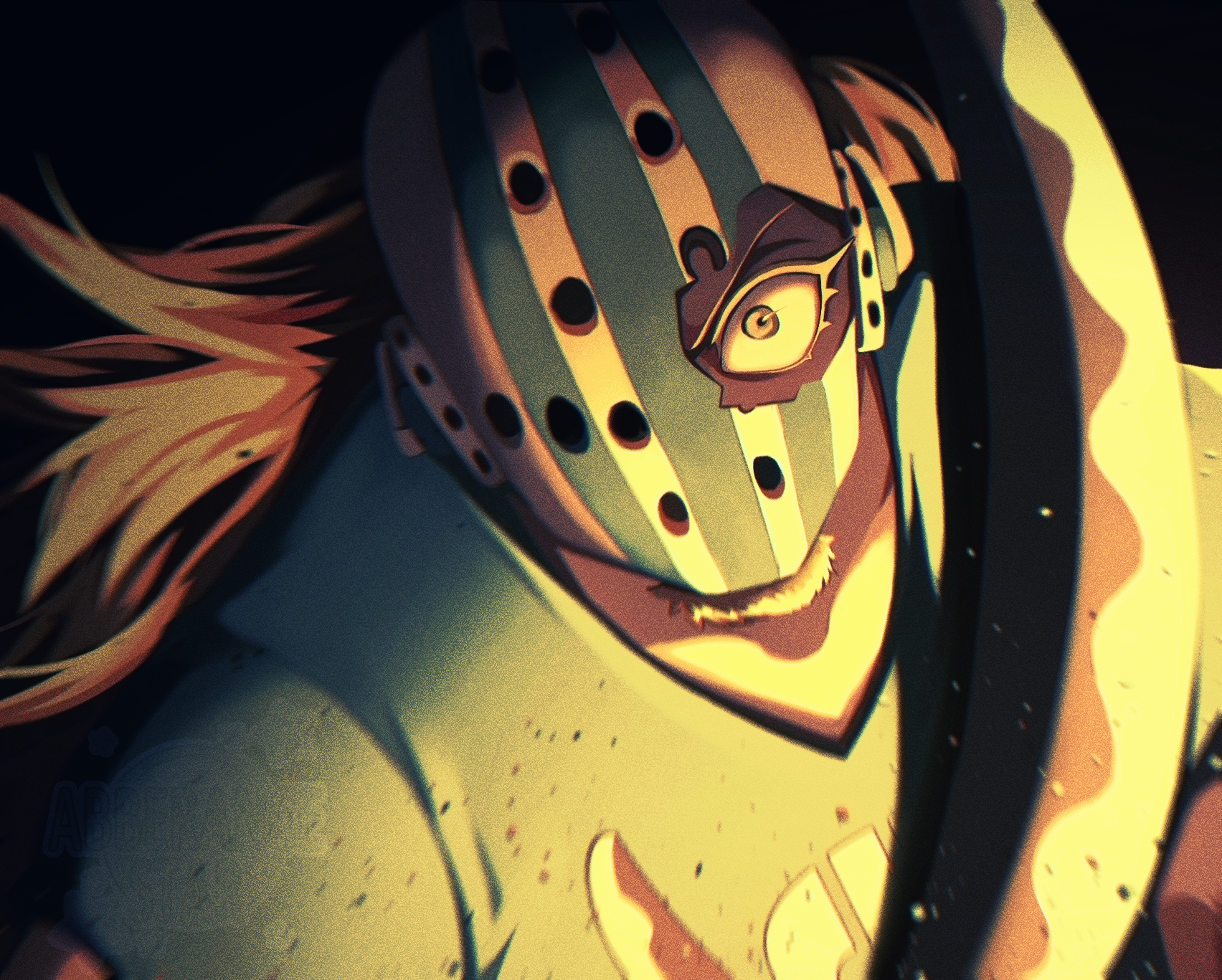
Filters are a MUST, they harmonise everything ! On Clip Studio Paint, I usually use the "gradient map", as it fits perfectly with the desired result. Chromatic Aberrations and the noise filter were, at first, used to keep my art safer from image generation AIs, but it gives a...je ne sais quoi that I like.
While I usually make thumbnails when I make illustration, and since this artwork is technically a redraw of an older one. Thumbnails are very quick paintings/sketches to get a somewhat vague idea for the actual sketch. It helps me visualise the composition before starting the actual sketch.
It also helps me with visualising the shading, lighting and color scheme. I stay messy with the pause, background, and details.
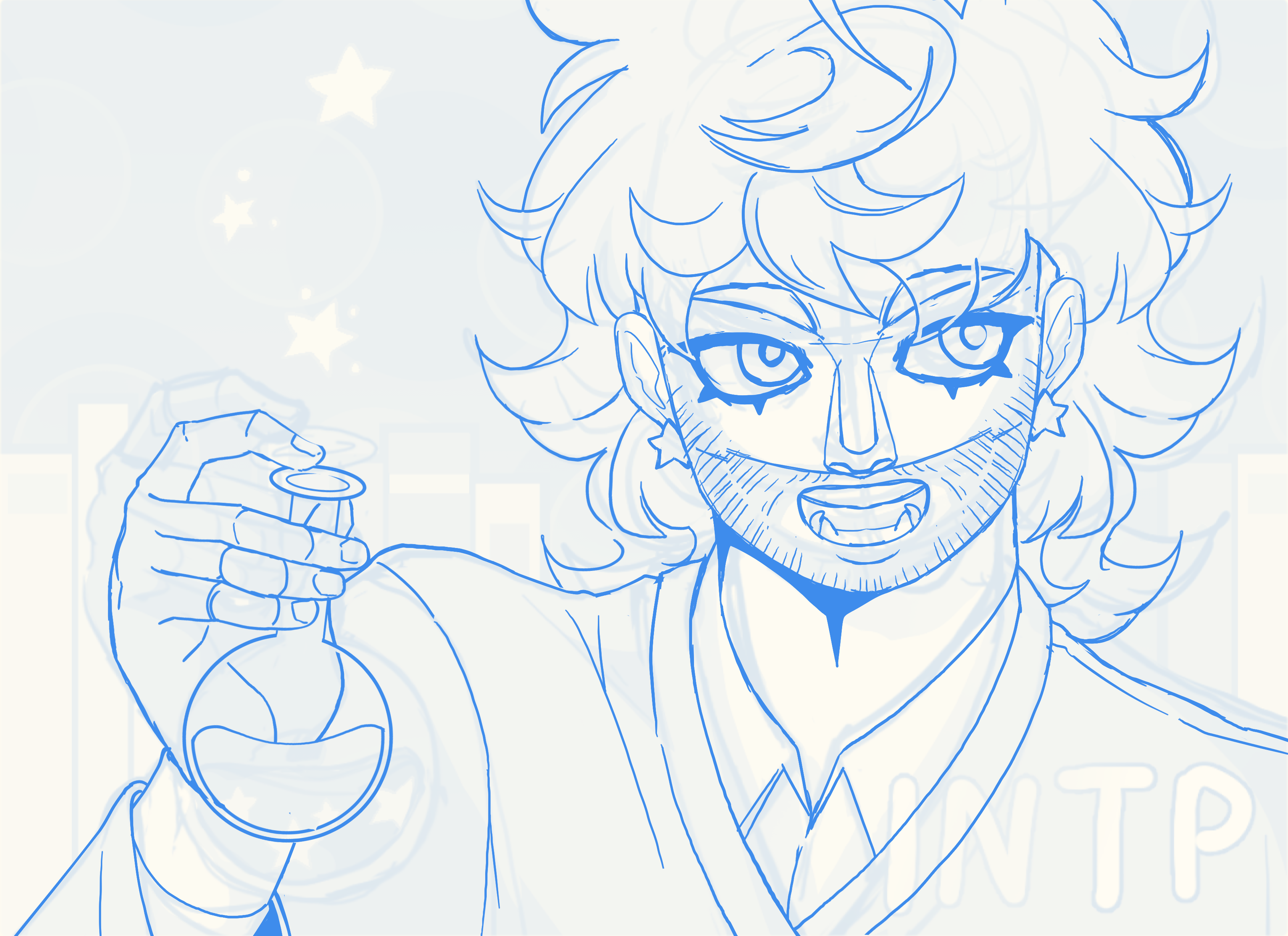
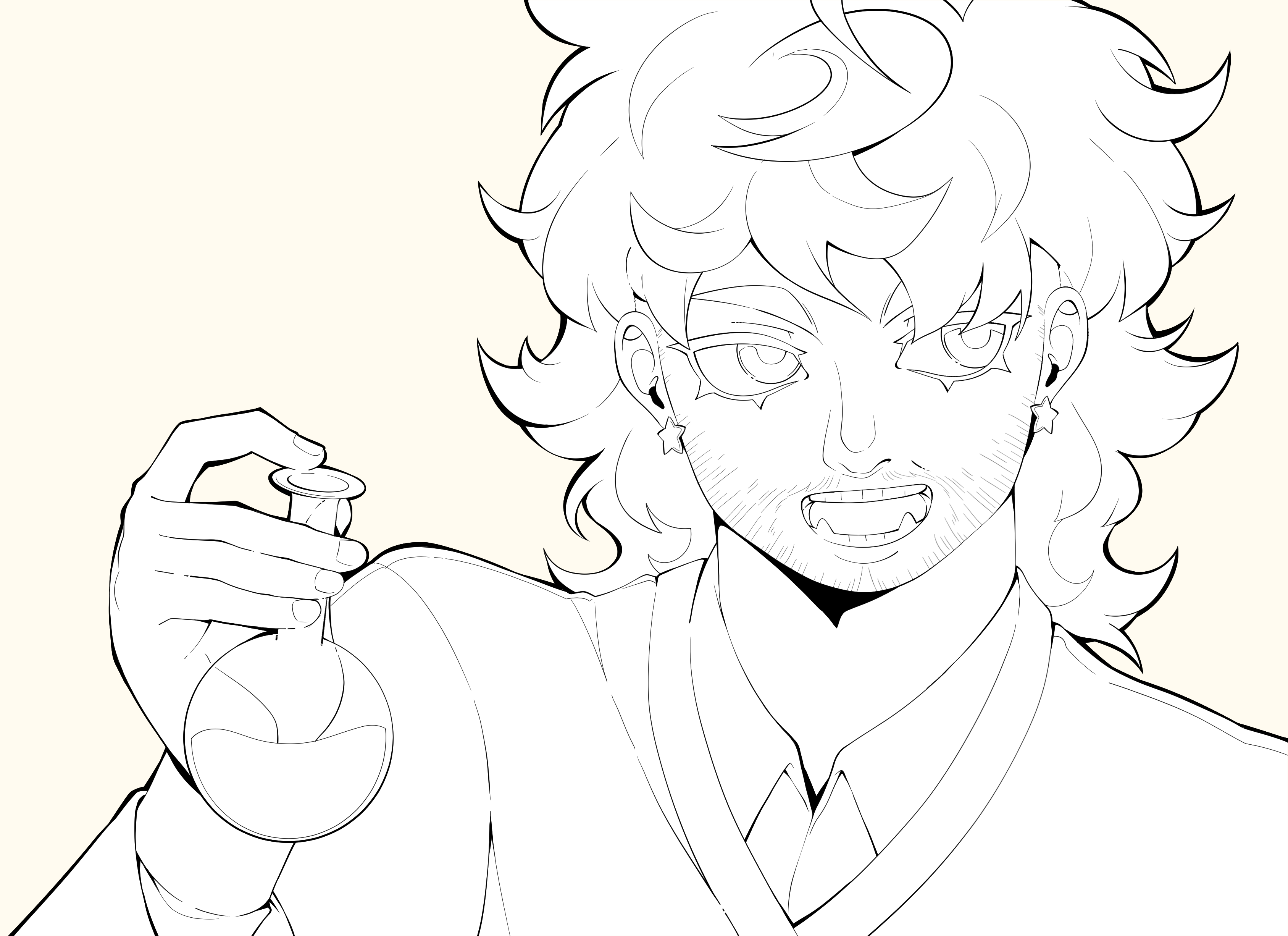
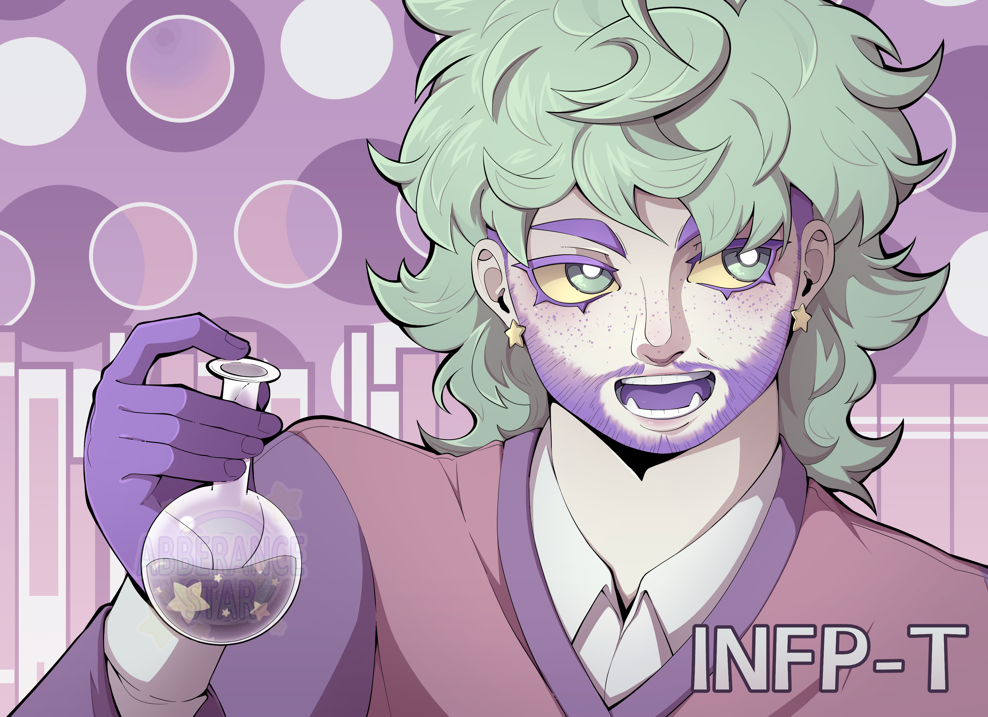
Like said earlier, I enjoy finer lineart with lots of line variations. Though it does tapper at the edges, it's not 100% fine and fading, it keeps a certain width. Not all the lines are trully connected, as you see here.
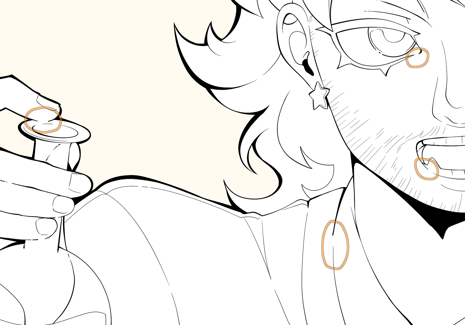
I cut out the line art where surfaces touches, I don't know why, it just looks better for me. I don't color the lineart yet. I also thicken some angles, like with bangs and folds, to empathise these shadows... When it comes to outlining the whole silouette, I don't usually thicken the lines, but I do it when I really want to detach the silouette from the background.
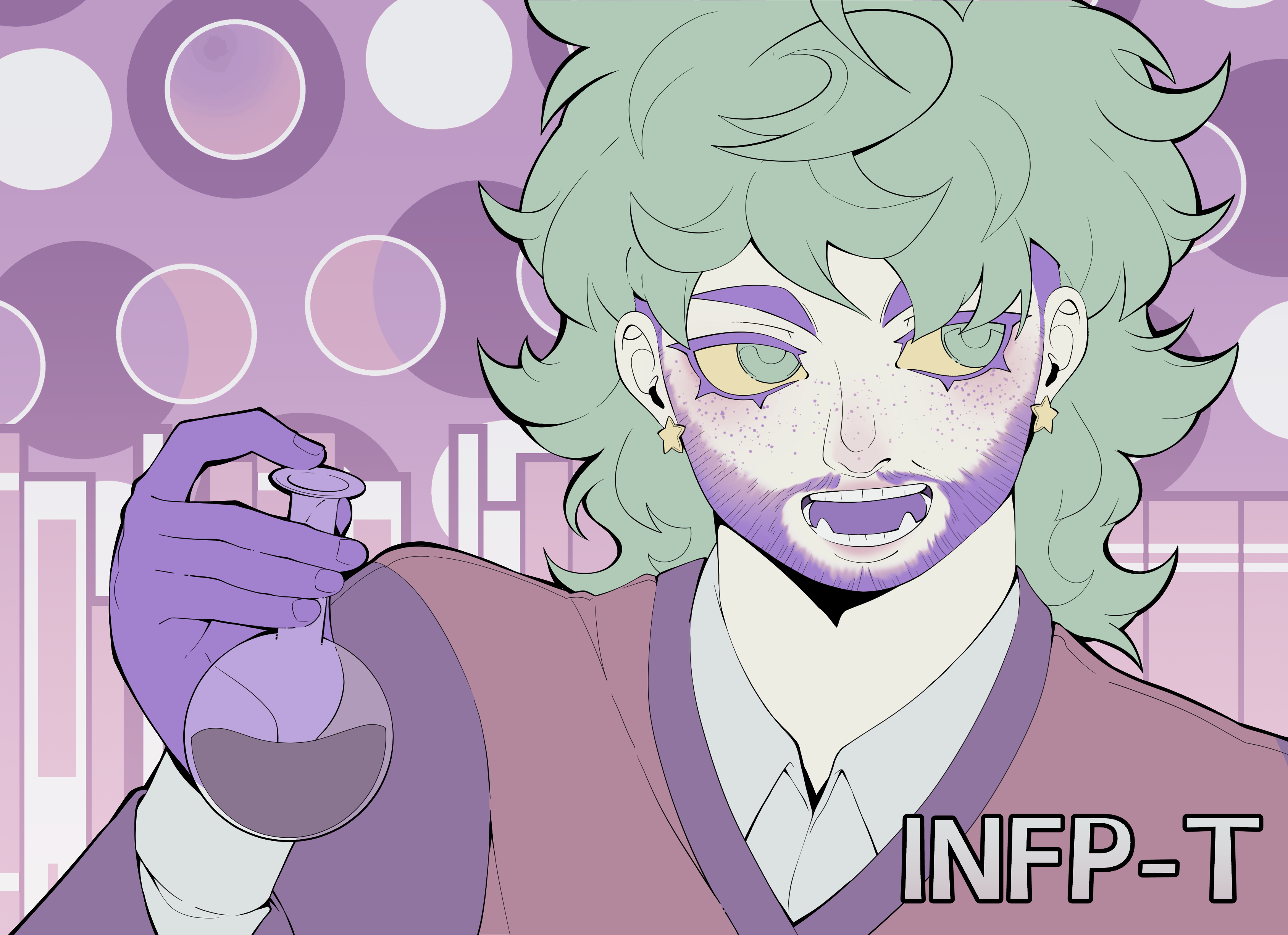
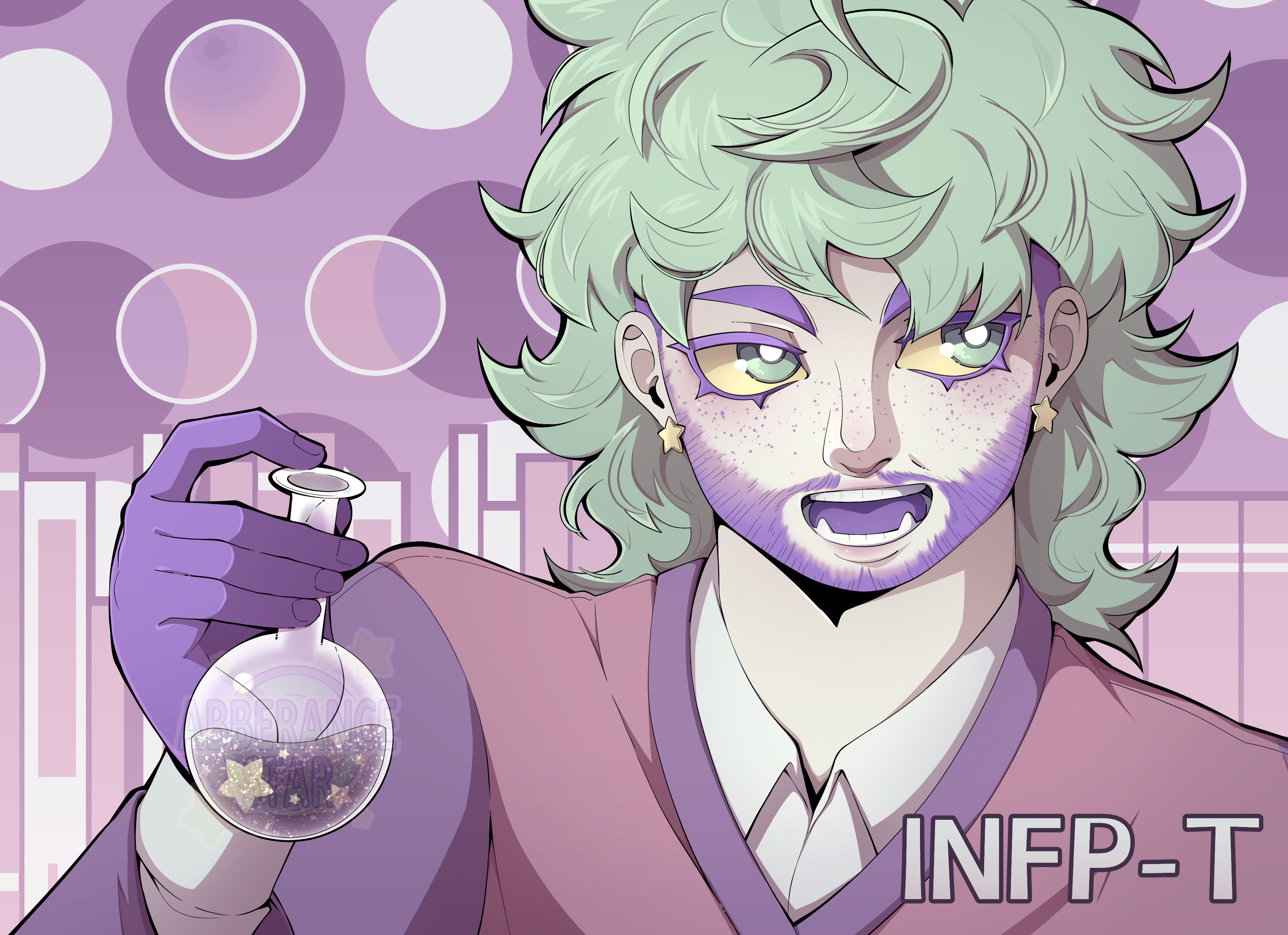
Despite being called "flats", they're not totally flat colors, they're actually gradients ! I posted a completly flat colored version of this step...
And with gradients...
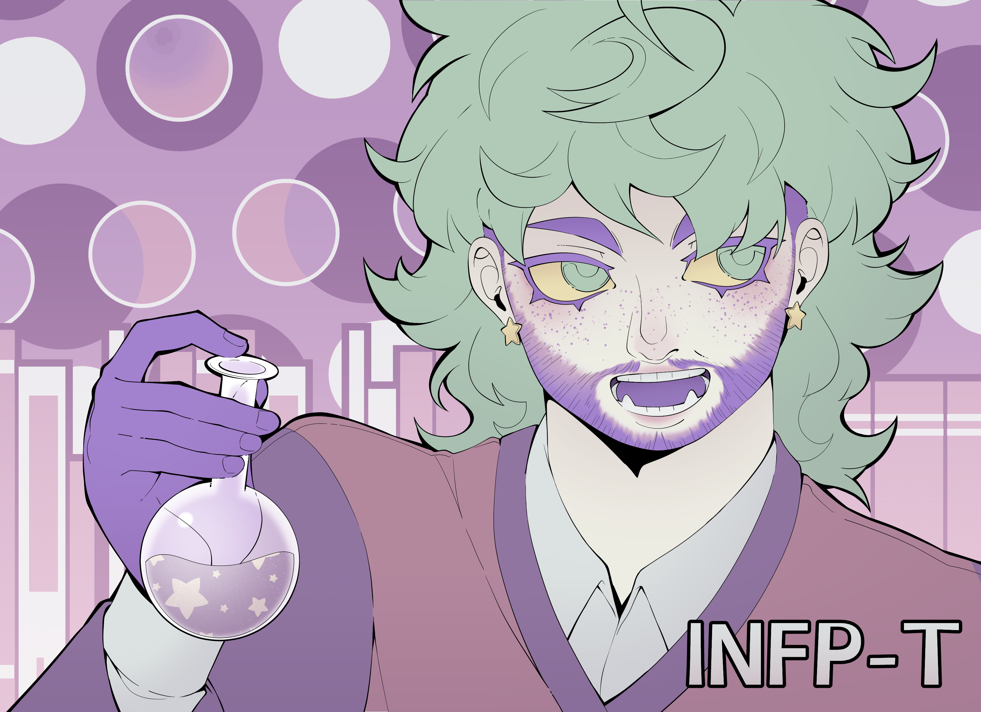
Much better, isn't it ? I prefer the look of gradiants. It's also helpfull to see if I actually want to shade it, or leave it as it is (see "notes" as a comparaison with the final).
Though I don't hate the look of softer shading, I prefer it bolder with hard edges. I don't use a specific color or layer mode/blending mode, and pick each colors according to the mood, background and local color.
However, how hard or soft it is depends heavily on the illustration. I keep softer edges for more elaborate illustrations, since I find it harder to control and do.
Unless if the material is shiny or reflects lights well (like wet hair, gold, metal, eyes, etc), I keep the lighting to a minimum. I don't like putting too much lighting to fabrics since it rarely reflects lights a lot.
Just like with shading, I prefer to pick up specific colors instead of using layer modes. But if I have to, I use "add" for softer lights, and "glow dodge" for brighter lights.
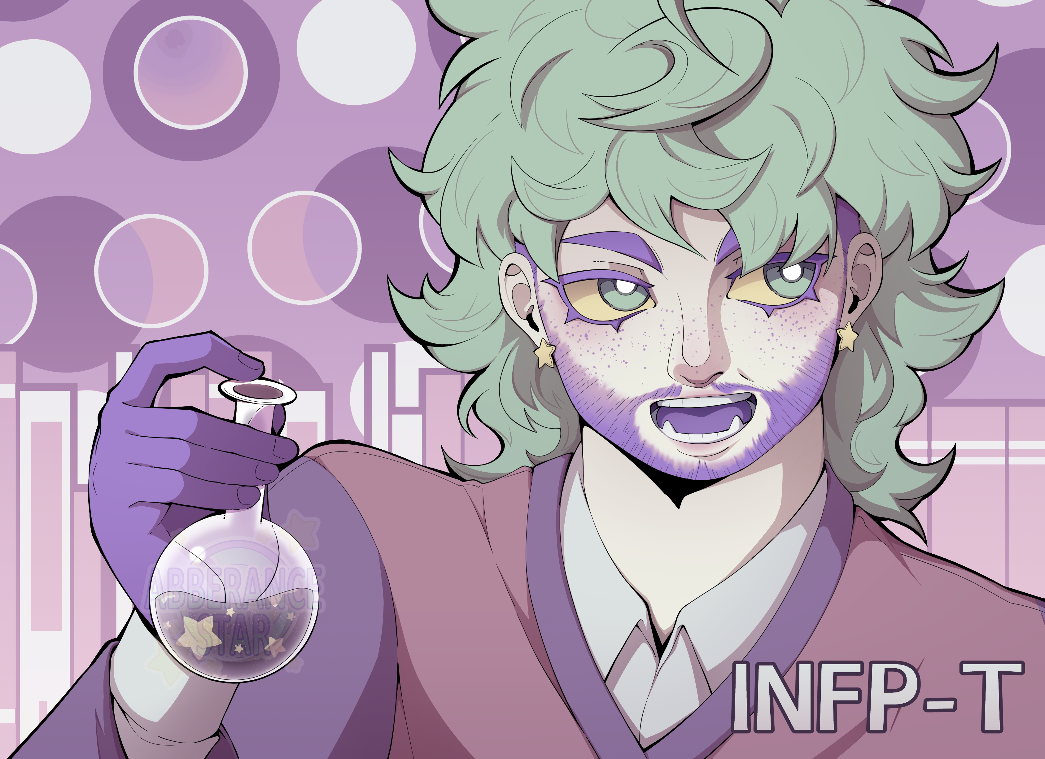
By details, it includes but it's not limited to : hair sticking out, rendering mistakes, shines, and more.
This is also when I color the line art.
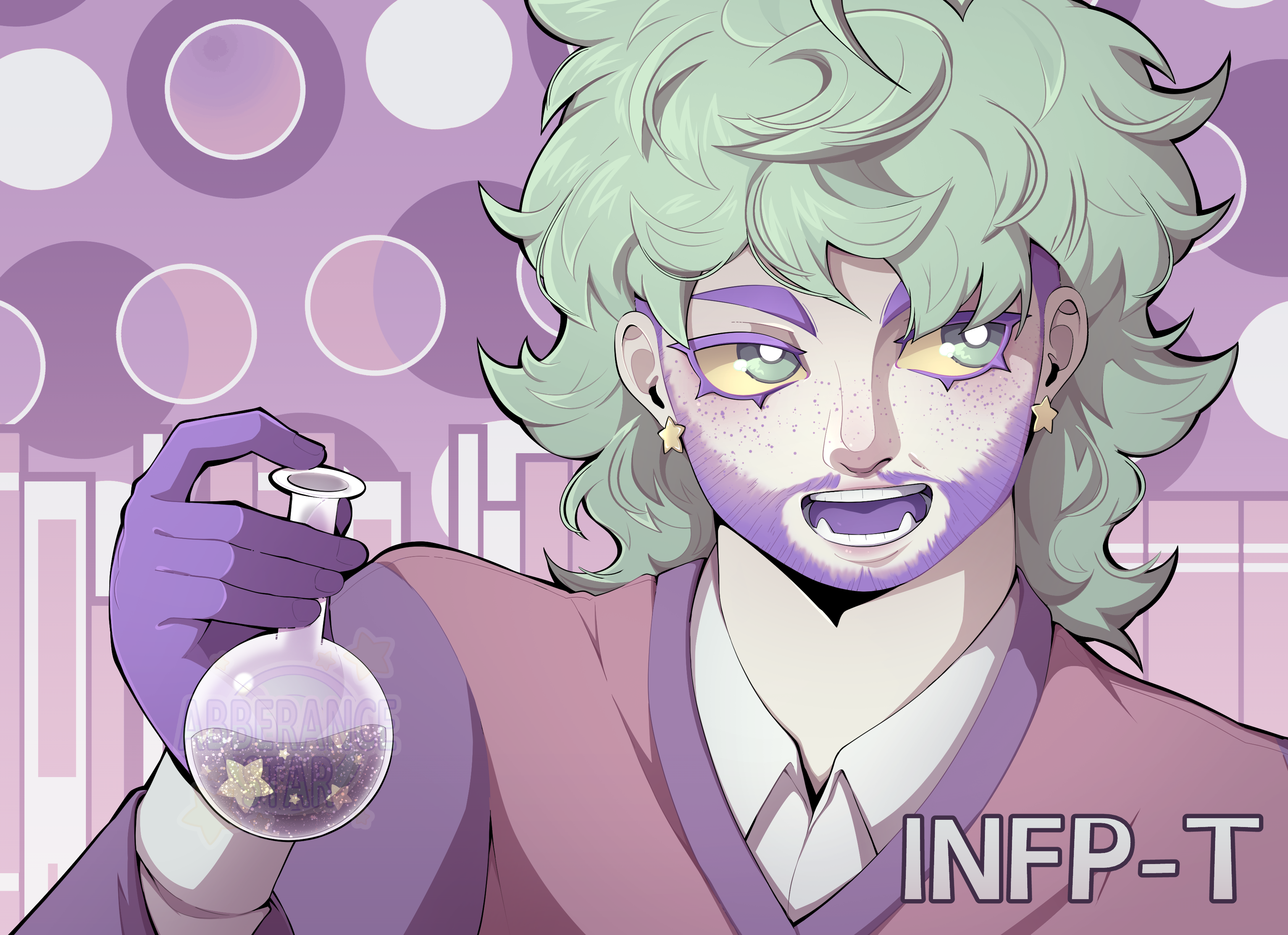
Filters helps me harmonise everything. I use gradiant maps, color balances, and more layers with random blending modes (I switch blending modes until one fits well).
And that's how I draw most of the times, with my usual art style !
=> I don't always fully render my drawings. Sometimes, I just skip the shading and lighting altogether to jump straight into coloring the lineart and filters.
=> Even though I have my art style, I can choose to alter my process whenever I feel like it. This one has no line art at all and has been rendered a lot more than I usually do. It takes forever so I won't draw like this for commissions.